
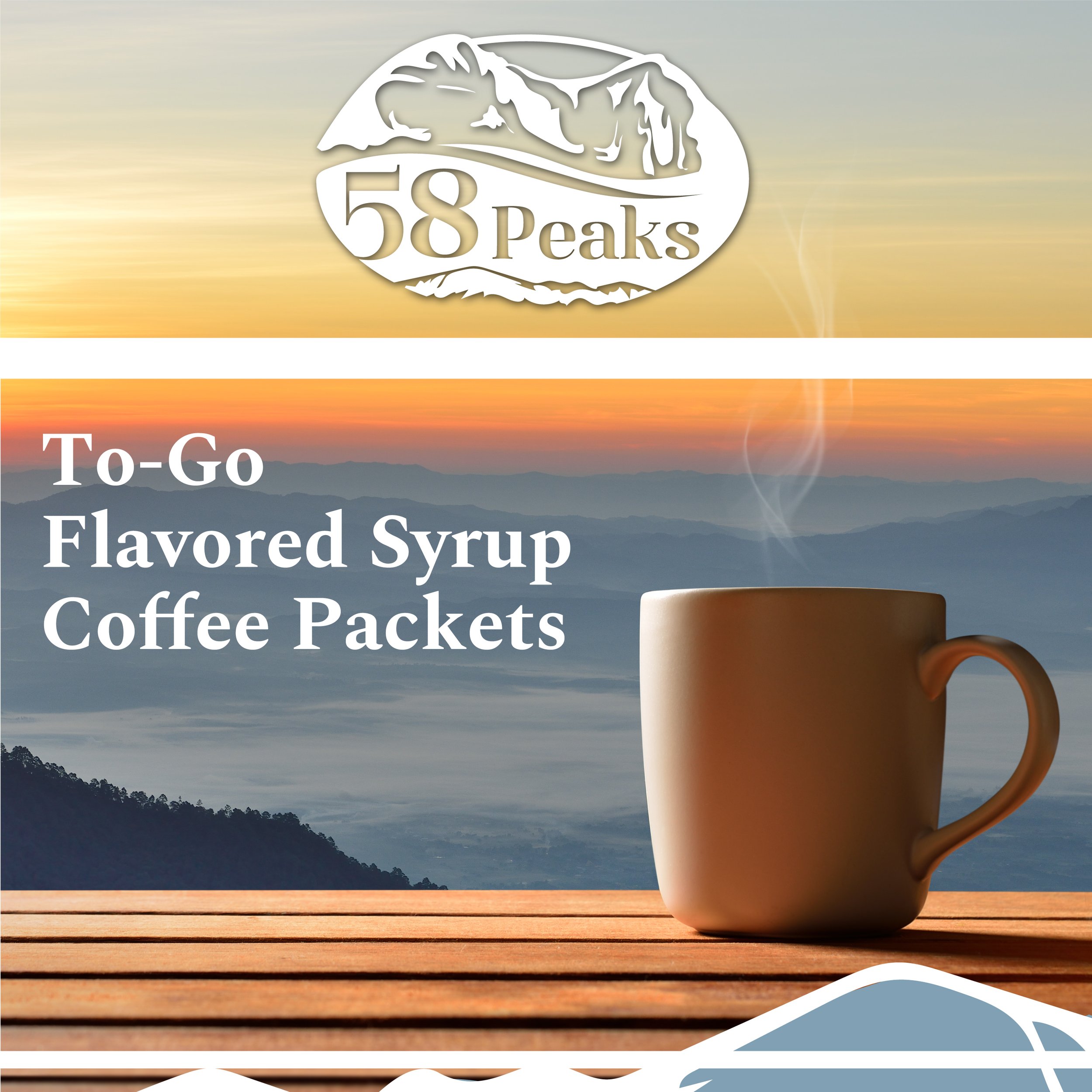
58Peaks
Take Inspiration With You On The Go
A name inspired by the brand’s headquarters based in Colorado, we sought to build a brand that evokes the movement of nature.
Our team illustrated the logo and built all brand assets from scratch, maintaining the nature theme through a coffee bean logo that includes a nod to the mountains that encompass the brand’s backyard..
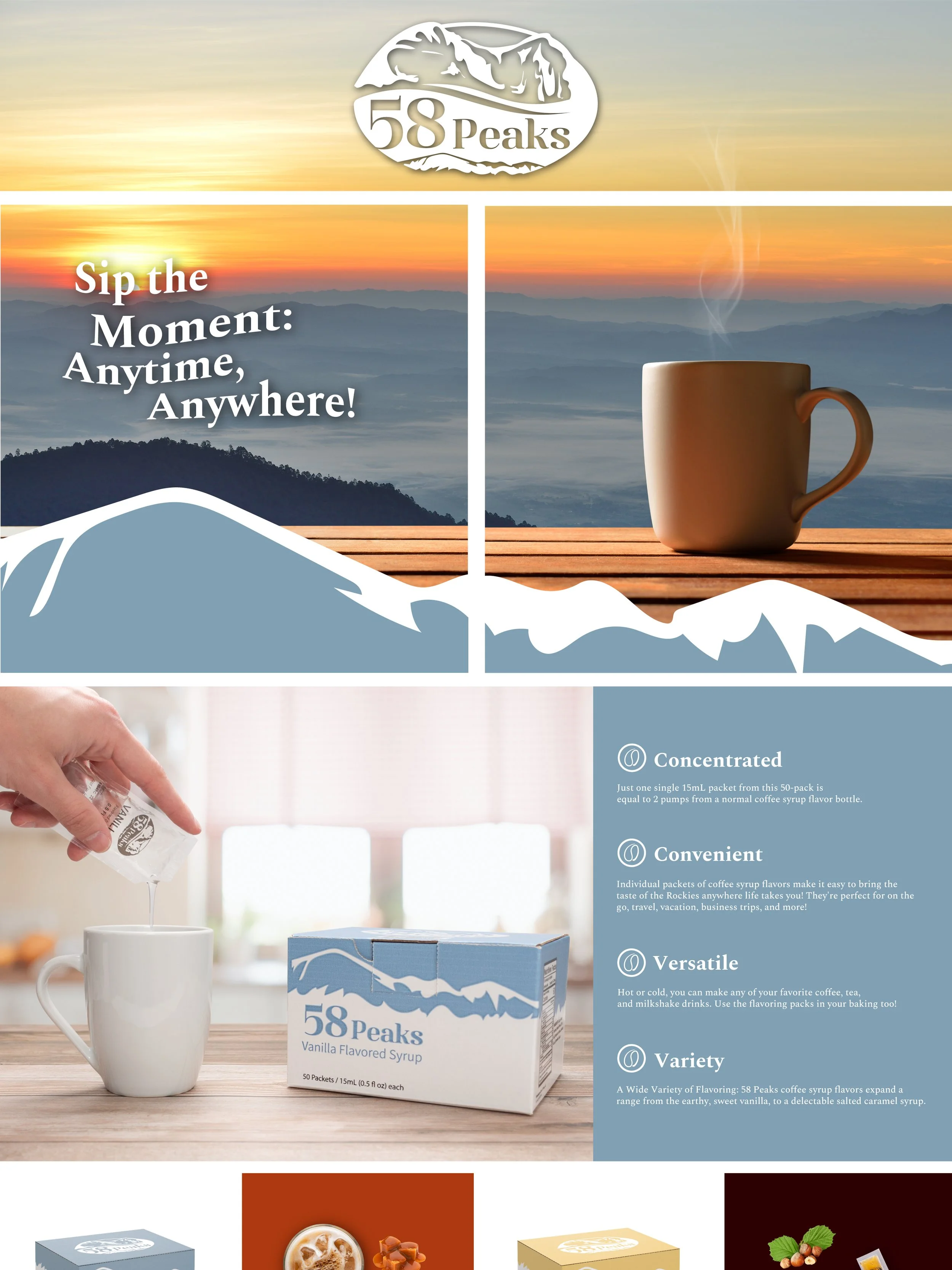
The overall image we wanted to evoke was enjoying a warm cup of coffee on a cool morning, while watching the sunrise over the Colorado mountain peaks. We selected red and yellow as the primary colors of the brand to accompany the feeling of a warm sunrise.
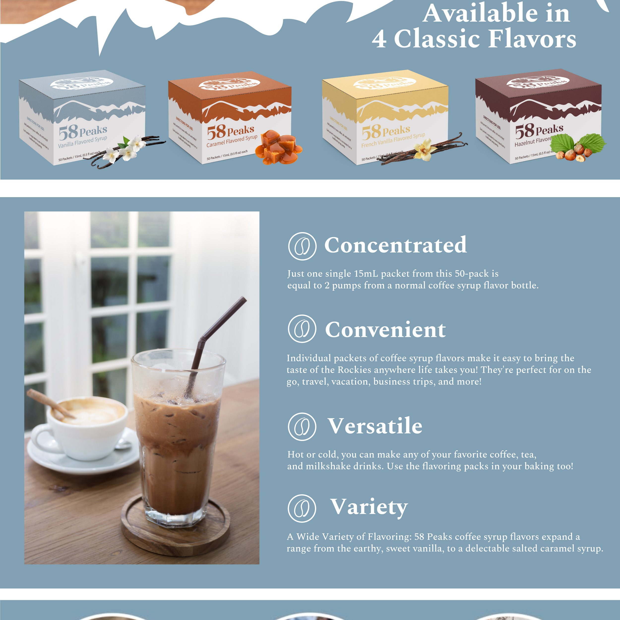
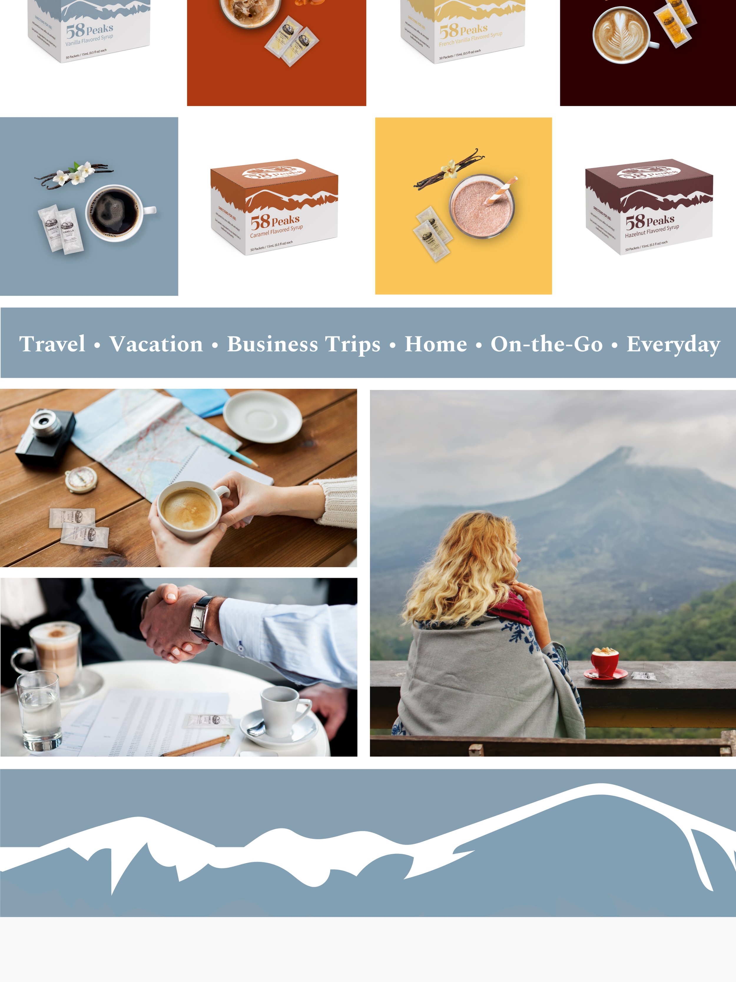
Colors were then selected to represent each flavor uniquely, but overall we had the brand, packaging and feeling of this brand. From a simple idea to a fully realized brand, packaging and e-commerce presence, we helped to build all of this out.


Brand Development & Packaging

Product On White

Product On White Infographic

Lifestyle Composite

Lifestyle

Lifestyle Composite

Infographic
Amazon A+ Content
Amazon Brand Store